
Overview
Product
Pathway2Careers, a learning management system and career education tool
On this project, I was hired by a development agency to design a learning management system (LMS) for their client.
One of the goals for this project was for the LMS to offer a fun and interactive way for students in kindergarten through 12th grade to learn about different careers and explore their interests.
By creating a dynamic and engaging platform, we were able to help students learn about potential career paths and equip them with the knowledge and skills they need to succeed in the future.
When I joined this project, the product had many features planned, but frontend functionality and design were still in the early stages.
My role on this project was to expand the product’s LMS and design engaging learning features to help the product compete with other similar products on the market.
Expand the existing LMS with features required for a fully fledged teacher and student experience
Design learning features to help students engage and explore the career education offered by the product
Storymapping
Secondary research
User interviews
Design
Helping teachers easily grade classroom assignments
One of the first major features we worked on was adding scoring functionality to the product.
Teachers were able to add assignments to students and classrooms, but had no way to score the assignment after students marked them as completed.
Hidden complexities
Though the problem seemed simple, hidden complexity led to a lot of discussion about what to do in edge cases such as a student skipping a question, whether assignments should be able to be re-assigned, how to treat questions with multiple sub-questions, and other non-obvious states.

Multiple approaches
One question which came up during the design process was how to provide helpful accelerator for many submissions of the same assignment.
An early version of the design proposed having the user navigate through questions in a slideshow format, with half the page dedicated to teacher notes and the other half displaying all student responses to a question.
Because secondary research showed that this was not a typical format for scoring assignments, we instead chose to prioritize implementing a view dedicated to each student's submission instead of a page displaying one question from all students.

Finding the right solution
The developers of this project did a lot of heavy lifting to explain technical feasibility and tradeoffs of different options, which helped us arrive at the best solution for the existing state of the product.
The solution we implemented allowed teachers to score assignments on a predefined scale, and added accelerators such as shortcuts for navigating between student submissions.
Features and accelerators which fell out of scope for this piece of the project included alternate views for assignments, a notification system to alert students of newly scored assignments, and the ability for teachers to assign a subset of questions to students.

Implemented version of teacher's view for scoring assignments
Guiding K-12 students to careers that match their interests
To provide career information to students, we used the O*NET service provided by the Bureau of Labor and Statistics. Using the API's for this service provided us with a huge library of data for about 16,000 different careers from various fields.
A big challenge of working with a library of that size is to guide a user to items most relevant to their interests.
We solved this problem by creating activities for students to complete, and recommended careers based on student’s results from these activities.
Keeping students interested
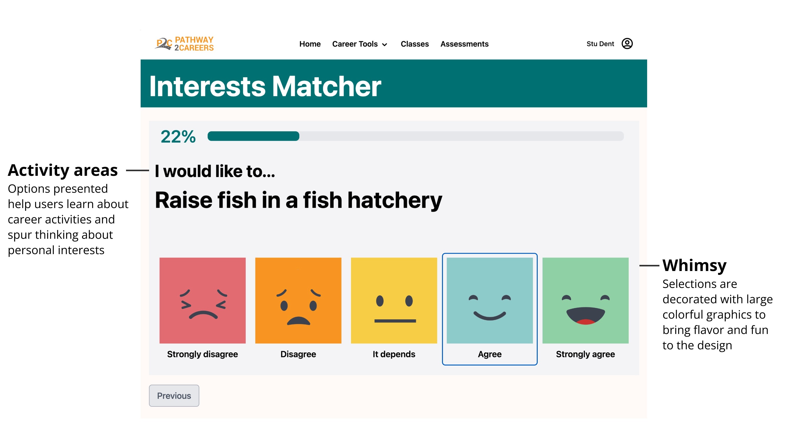
In the final design, students are guided through a type of personality quiz with fun art created by Kari Stillman
Personalized results
In order to provide a unique and customized experience for students, the product uses activities which students about their interests. This helped students build a mental model of ideas about careers, and also help our product highlight careers that matched student's interests.

Students received personalized recommendations based on interests they share in the product's different activities
Creating a sense of progression
As students move through activities and add accomplishments, their progression is collected inside a student dashboard. This let users see a page that gradually grows and evolves as students continue various activities in the system and complete optional lessons included in the product.

A student dashboard collects results from various activities in the product
Research and artifacts
The redesign largely focused on:
improving readability
revising content to be more clear
redesigning interactions to function in more typical ways
Because the client had a clear vision for the product they were hoping to build, I began a storymapping workshop to better understand intentions and the required feature set of the product.
This workshop helped me learn details of the client’s vision, such as being able to be used by students for several consecutive grade levels.
I was also to learn more about the wider LMS and career development market, comparators and competitors, and brainstorm how required features might function.

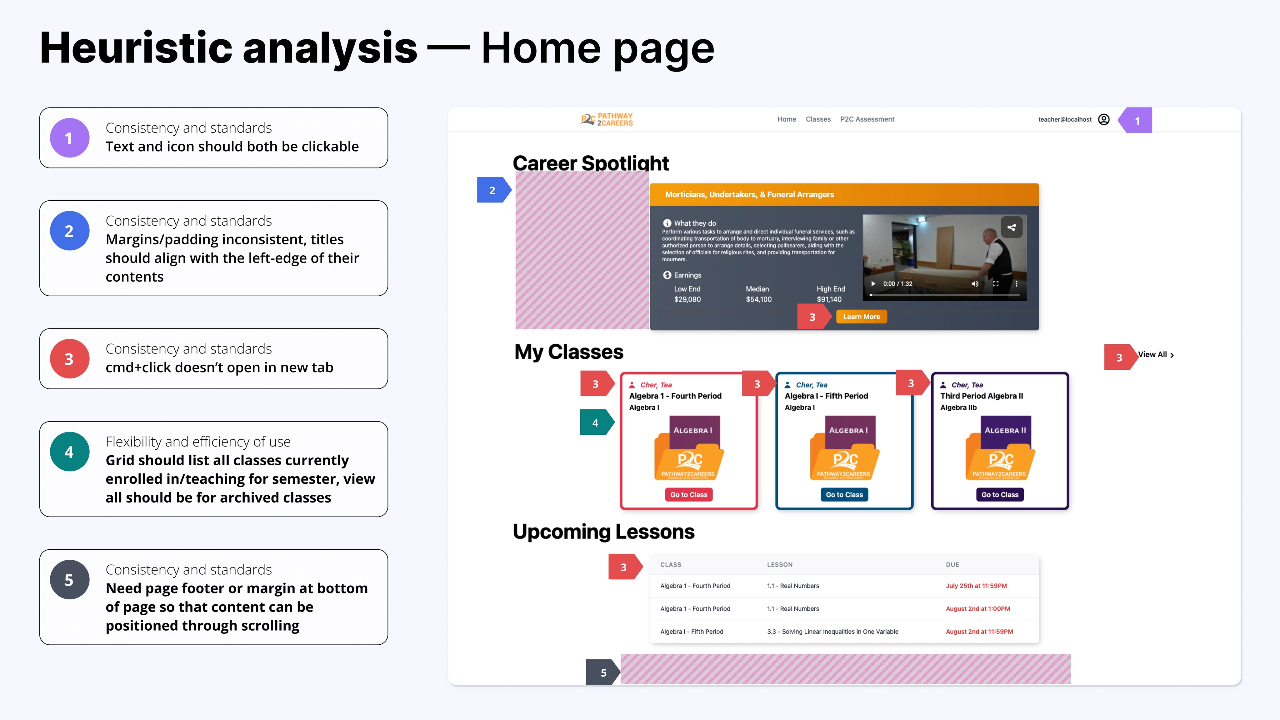
To understand what already existed in the product and any oddities that existed, I conducted a heuristic markup of all existing pages.
The review helped me learn about functionality that was implemented, partially implemented, and areas that needed to be designed.
This review helped improve:
Consistency of margins and page widths across breakpoints
Accessibility, via adding H1, H2, H3 tags for headings
Interactions, such as removing hover states from items which are not clickable
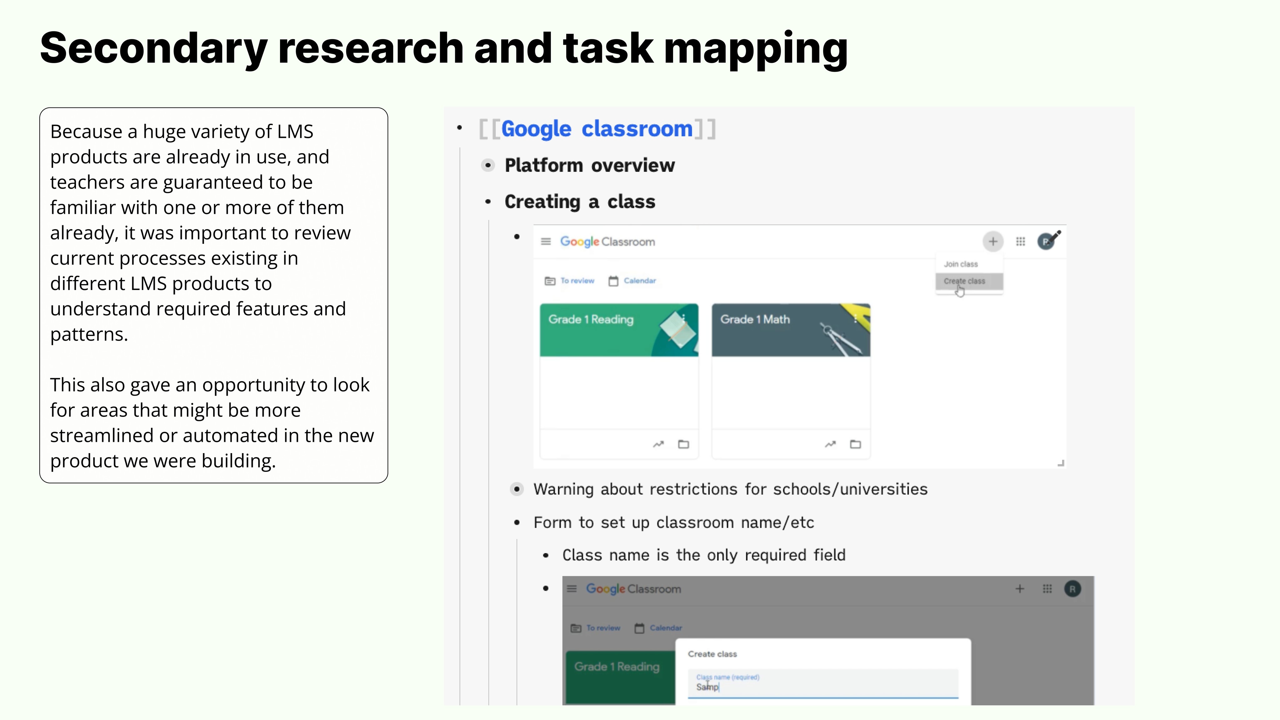
Products compared:
For products which I couldn’t gain access for, Youtube training videos ended up being a huge boon for understanding functionality of other LMS products.
As the product grew larger than a handful of pages, a sitemap helped guide productive conversations about where things lived and where things were going to be.

User interviews and usability testing
Usability testing on this product turned up lots of great information about how the product was being used in the real world, what parts of the product were working, and how it might continue to be improved in the future.
Usability testing was done with teachers in an alpha rollout of the product who had been using the product part-time within their classrooms.
Here's some of our high level findings from usability testing:
Teachers like the look and feel of the digital scoring, but don't use digital assignments
In interviews, teachers made note of the look and feel of the digital scoring, and commented very favorably compared to competitor products.
However, because digital lessons only have the option to be assigned in their entirety, they ended up being difficult to use compared to their PDF versions.
Teachers would assign specific slides or questions from PDF versions, functionality which digital assignments didn't allow.
Because technical constraints prevented granularity in digital assignments, solutions for assigning specific questions to students and hiding unassigned questions or subsections were added to a roadmap.
Wayfinding for course content is unclear
“I don’t know what’s in Chapter 3 versus Chapter 4.” — Research participant
Because curriculum chapters are titled as Chapter 1, Chapter 2, Chapter 3, etc. there’s not a clear indication of what’s contained in each chapter.
Using descriptive titles, enhanced search functionality for lessons, and a table of contents were solutions we used to revise and improve content.
Teachers want PDF and PNG uploads for teachers and students
“Some assignments might just be written notes without any questions.” — Research participant
Teachers wanted the option to add PDFs with instructions for assignments they give to students, and want students to be able to upload PDFs or PNGs with their submissions.
This lets teachers customize assignments to their specific classroom and lesson plans, and lets students have more options in the types of assignments they can complete.
Challenges and learnings
Designing an educational product for students in kindergarten through 12th grade includes a number of tough challenges related to color, content, and interaction design.