Making a school application form easier to complete
Overview
Client
Prime Digital Academy, a UX bootcamp
Prime Digital Academy (also known as Prime) is a school in Minneapolis, MN which offers an an excellent UX 18 week UX immersion program.
I currently support the UX instructors at the school as a Senior Program Coach for the UX program.
Context
Prime’s application process is time consuming for applicants
In total, the typical application takes 7 to 10 hours to complete.
The majority of that time is spent on a Full Stack Engineering or UX challenge at the end of the application, which applicants are required to submit a solution for.
This provides applicants a taste of what the program will be like before they start the program.
The application challenge contributes to:
high completion rates for students accepted into the program
high placement rates within the industry post-graduation
Problem
The current application experience leads to confusion for users and extra work for staff
Applicants currently need to work through a tough application form.
Parts of it have instructions which are unclear, usability issues that interrupt users, and frames the process in ways that cause extra work for staff.
Goals
The goals for this project were to
Reduce abandonment rates of applications
Improve quality of applications
Reduce time spent in back-and-forth between applicants and staff
Methods
Job stories
Heuristic markup
Cognitive walkthrough
Interviews with staff
Secondary research
Researching the current state
Heuristic markup and cognitive walkthrough
After doing interviews and synthesis, I used a cognitive walkthrough to document the steps an application process, and heuristic markup to document low-hanging fruit and violations of best practices.
It made sense to me to combine these methods, because both involve stepping through the application, taking screenshots of each page, and documenting steps the user takes and oddities that occur.
I did this in Figma by taking several rows of screenshots. The first row documents necessary user interactions, and the second row documenting styling or interaction oddities. Additional rows were used to compare designs at different breakpoints.
This allowed me to:
keep clean documentation of how the current state looks and functions, and how the user moves through the pages
separately document where and why to propose changes for a future state
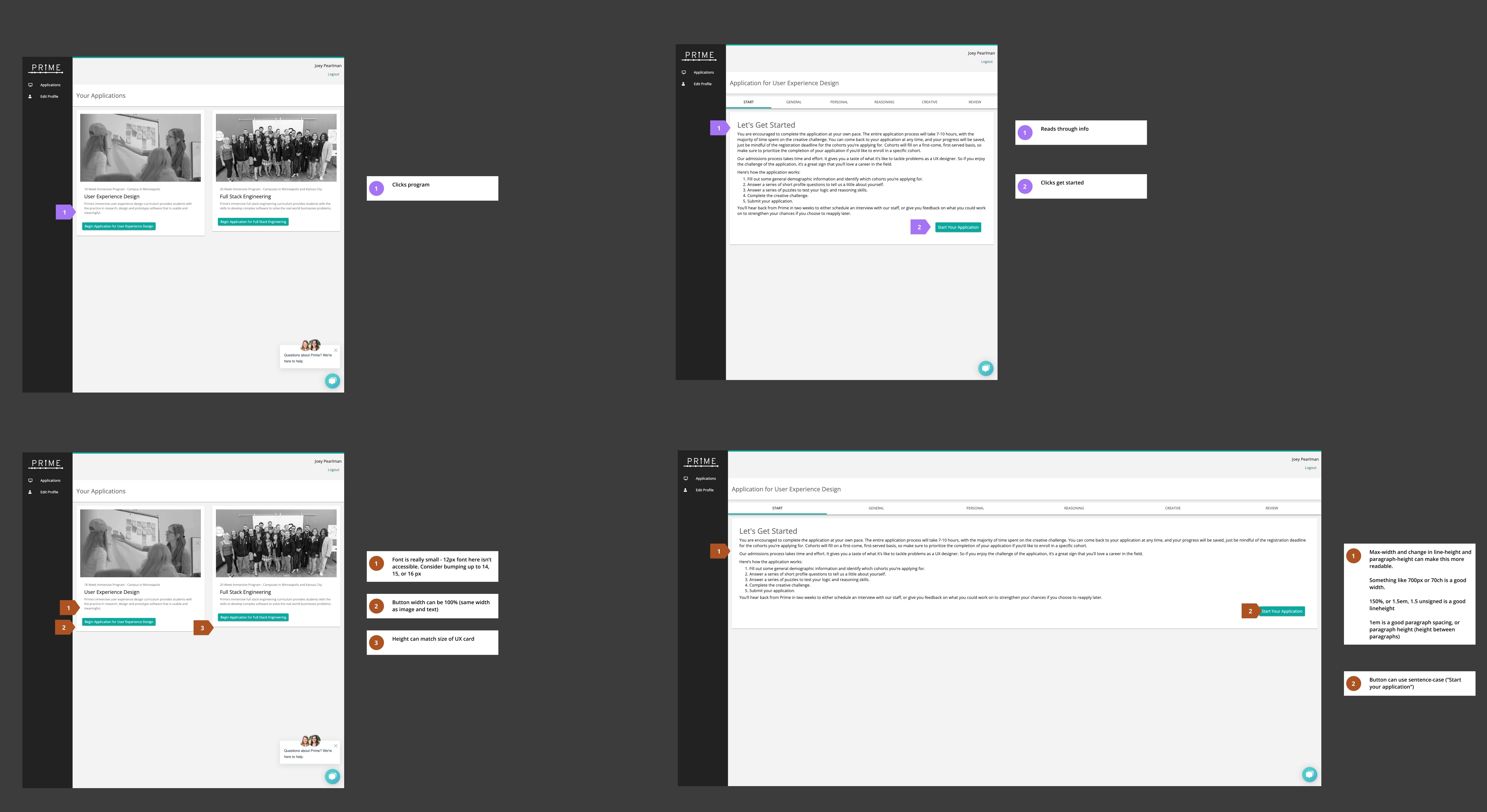
Examples from heuristic markup/cognitive walkthrough
Findings
Lack of onboarding communication
Currently, users need to create an account to begin their application process and save their progress.
In the current design, users do not receive a confirmation email when signing up for an account.
Because the application is a high-pressure, stressful task for users to complete, lack of a confirmation email on account creation may cause users to doubt whether they’ll be able to receive updates on their application status.
Readability issues
Throughout the application, there are typography settings which cause readability issues. Examples are missing max-widths or character caps for line length, default settings for line-height, dense paragraphs, and default spacing between bullets.
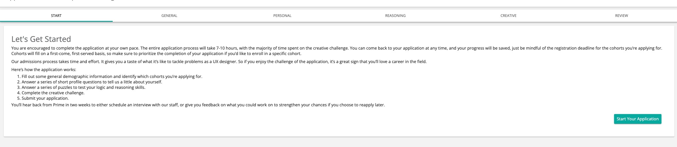
Example of long line-lengths causing text to stretch across the full width of a monitor
Outdated content
Because the majority of the application has never received any major updates, there were a lot of “dusty corners” within the application.
This language was documented so that I could collaborate with staff on revisions during the design phase.
Dense content
Some questions in the form include a scenario, a question related to the scenario, numbered answers, and then radio buttons with numbers as labels.
This is more layers of abstraction than needed, and can cause confusion about how to answer the question
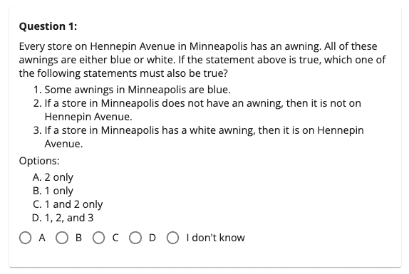
Example of an application question with unnecessary layers of abstraction
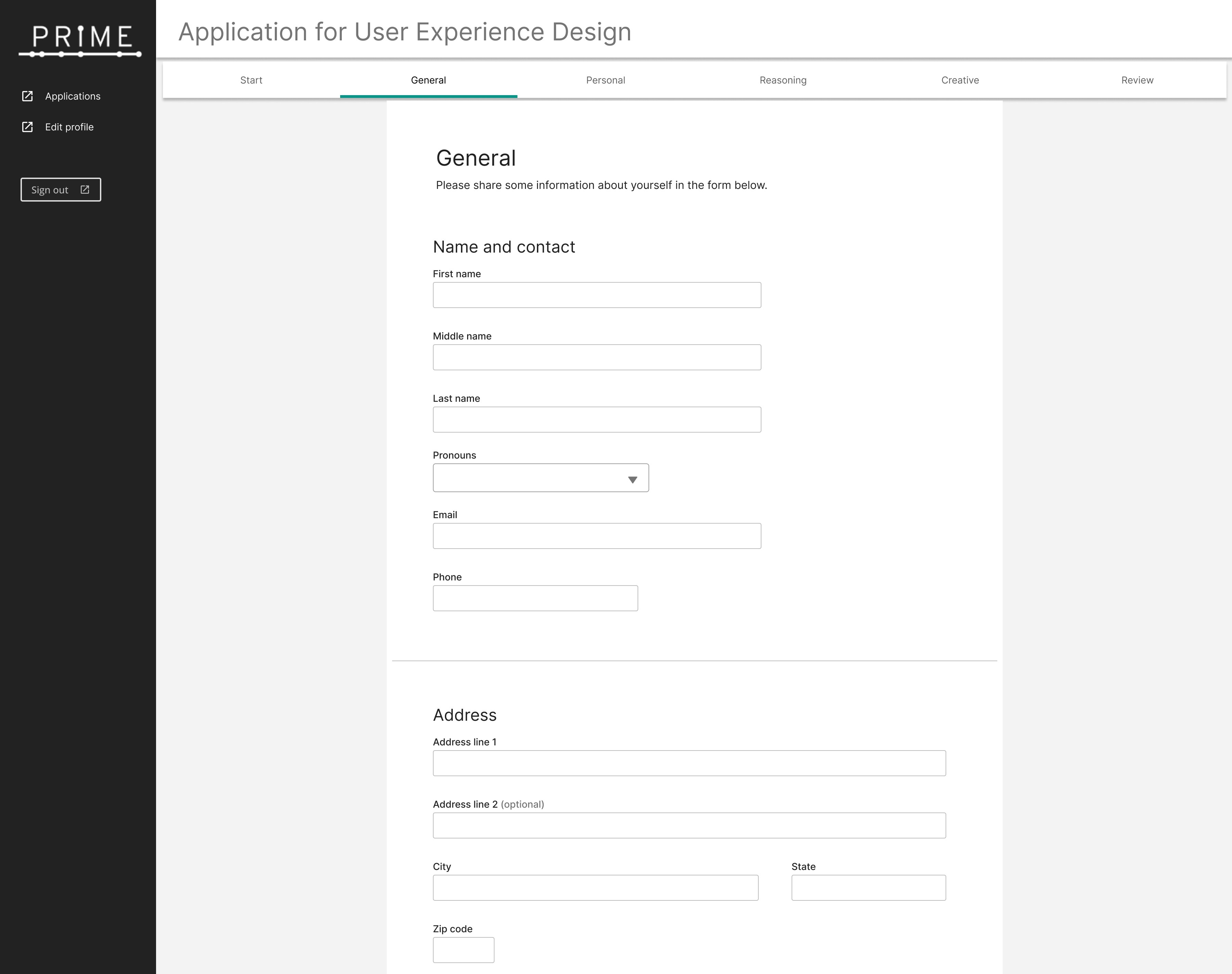
Form field layout issues
The original design has form fields scrunched close together, side-by-side, with all fields sized to 50% of the row width. This styling reduces vertical height, but makes the form appear more dense. It also makes the tab order for fields confusing — will the cursor move left-to-right or top-to-bottom?

Example of forms laid out side-to-side which can cause confusion about tab order, or which field should be filled out next
Text area interaction issues
In some questions, users are asked to respond to question prompts with multiple sentences.
Because the fields where users enter their response have a fixed height and are unable to stretch or grow larger, users interpret that to mean that there is a cap on answer length.
This leads to applicants providing shorter answers than the question intended.
Progress can only be saved when sections are fully completed
In the original design, users were unable to save their progress unless they answered all questions or filled out all required fields on a page.
Because the application is very lengthy, this is a fairly large inconvenience for users.
Redesigning the application
The redesign largely focused on:
improving readability
revising content to be more clear
redesigning interactions to function in more typical ways
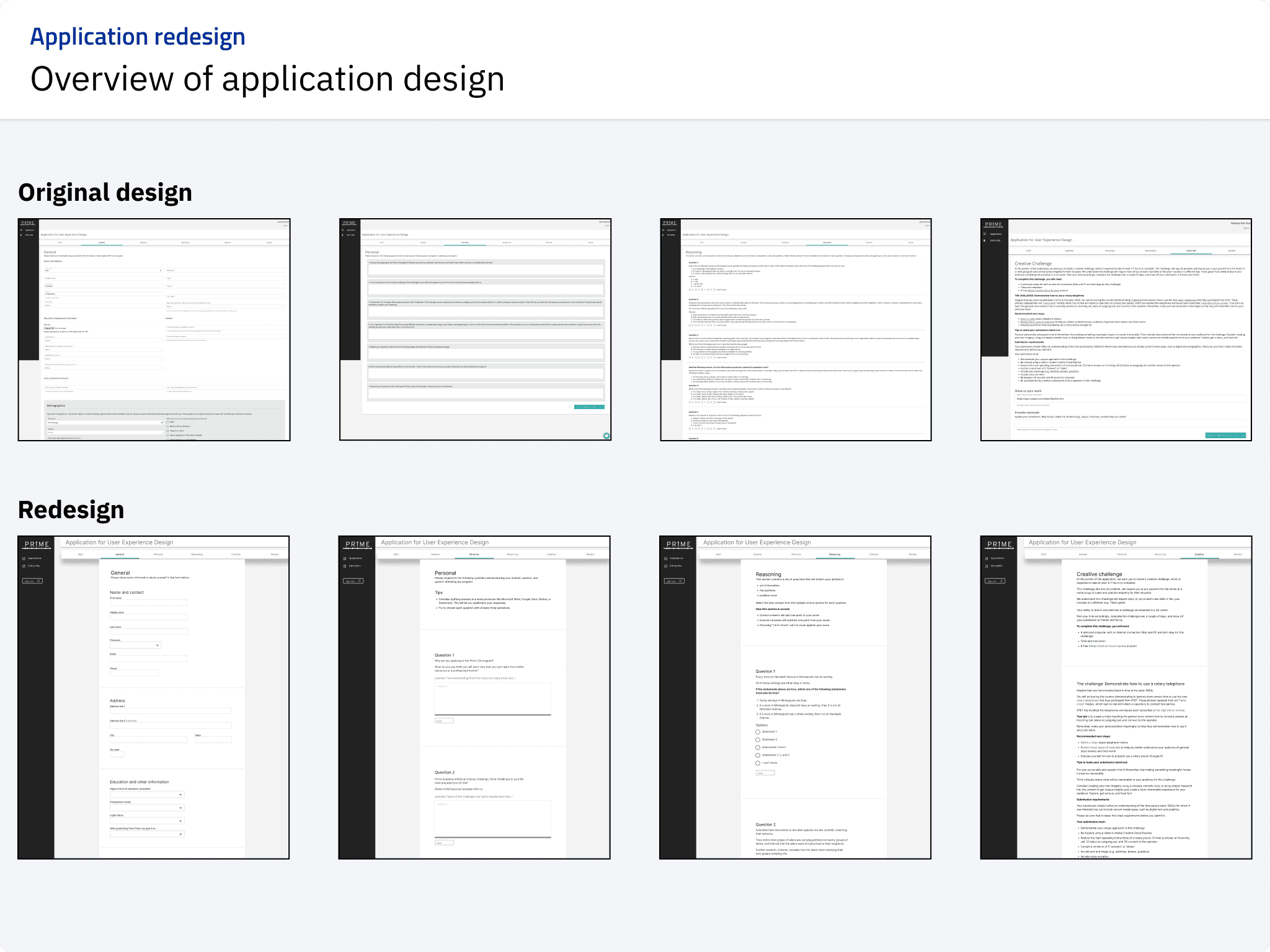
Original and revised application designs
Form revisions
Forms were revised to follow best practices outlined in the books Forms that Work by Caroline Jarrett and Gerry Gaffney, and Web Form Design by Luke Wroblewski.
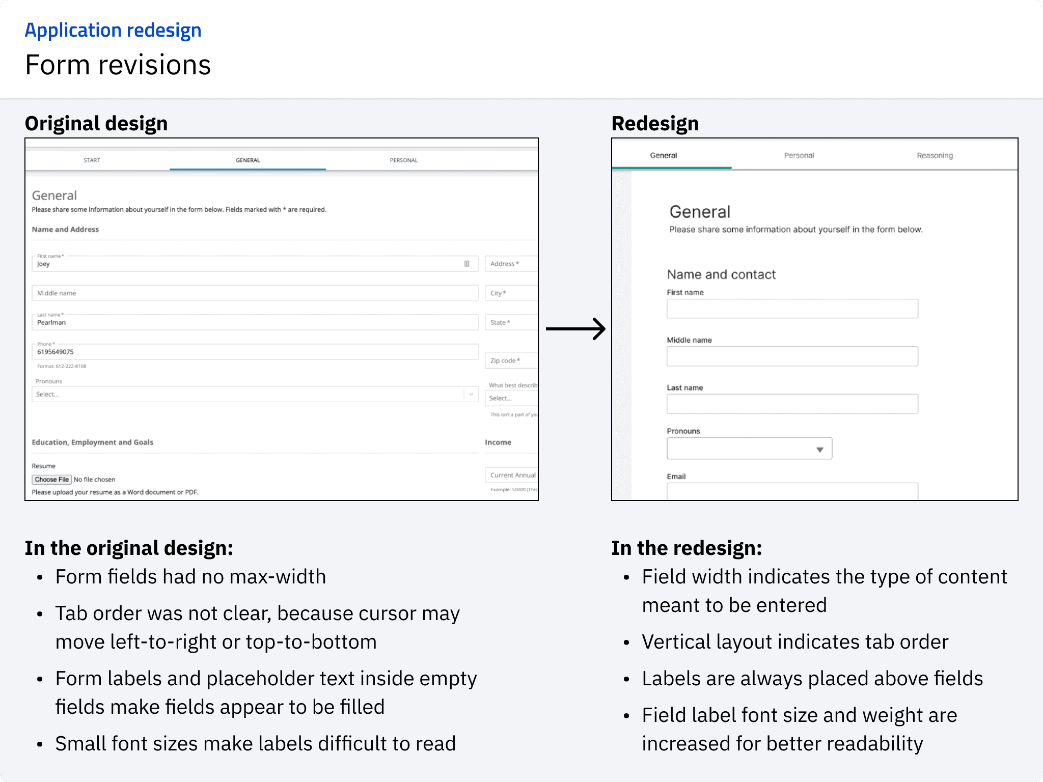
Original and revised form designs
Content revisions
When revising content, the focus was on building transparency about the application process and improving clarity about what types of information Prime is looking for in essay questions.
Content changes followed guidelines outlined at https://readabilityguidelines.co.uk/.

Original and revised form designs
Iteration
After drafting the redesign question formatting and adding text, I worked with Student Life to revise wording of content changes.
The biggest revisions were help text to essay questions — originally, I added examples of that start of answers. After discussion, we decided that it was better to add clarity about what the questions were asking, and
This was an important step to make sure that communications from Prime stayed consistent in terms of tone, terminology, and other details.
This collaboration helped check my own understanding of the purpose of some questions, and the new writing was improved as a result of working together.
Additional design
Some additional design work included:
Rewriting error messages
Adding ability for applicants to view previous versions of their application
Providing framing information about application process and timelines
Measuring success
These design are currently in development. Some key indicators we will be tracking for success are:
Time to complete applications
Abandonment and completion rates of applications
Number of applications completed
Additional artifacts
These are additional artifacts related to other problems tackled in this same project alongside the problem in this case study.
These artifacts were involved in redesigning the application process, and a larger-scale visual and interaction overhaul within the internal portal used by Prime.
Interview notes
Job stories
Flow diagrams
Interface audit
Design system/UI kit