
Overview
Client
Prime Digital Academy, a UX bootcamp
Prime Digital Academy (also known as Prime) is a school in Minneapolis, MN which offers an an excellent UX 18 week UX immersion program.
I currently support the UX instructors at the school as a Senior Program Coach for the UX program.
Context
The early weeks of the program are largely self-paced
The first six weeks of Prime’s program are part-time (estimated 20 to 25 hours of work each week), before switching to full-time (estimated 60 to 80 hours of work each week).
During these first six weeks time, students will
attend a weekly class
stay in contact with faculty and cohortmates through Slack
complete weekly assignments outside of class
Instructors are time constrained
At Prime, UX cohorts will have a slight overlap of a current cohort near graduation and a new cohort beginning the part-time piece of the program.
Because of this, an instructor will be
actively teaching a cohort close to graduating
supporting a new cohort beginning their six weeks of part-time work
During this period of overlapping cohorts, instructors have an extra-large workload to juggle.
Without robust resources to support them, instructors end up working overtime and can’t provide as high a level of support to students.
Problem
Learning design tools is an early challenge for students
In the second week of the course, Prime introduces popular design tools such as Sketch and Figma.
These tools are significantly differently than professional tools most students have used before, such as Google Docs, Keynote, or Powerpoint.
An early challenge for students is building a new mental model for working in design tools.
Students want additional support to them help them understand design tools
To help students learn how to use Sketch, Prime created a getting started guide.
However, feedback from students showed they felt the guide was too brief, and students wanted more support in learning Sketch.
Goals
The goals for this project were to
create a resource to help students learn the basics of Sketch
help students build confidence in their ability to learn new, unfamiliar skills
help students feel supported by Prime during this learning process
What already existed
Intro to Sketch PDF guide
A brief introduction with links to popular tutorials
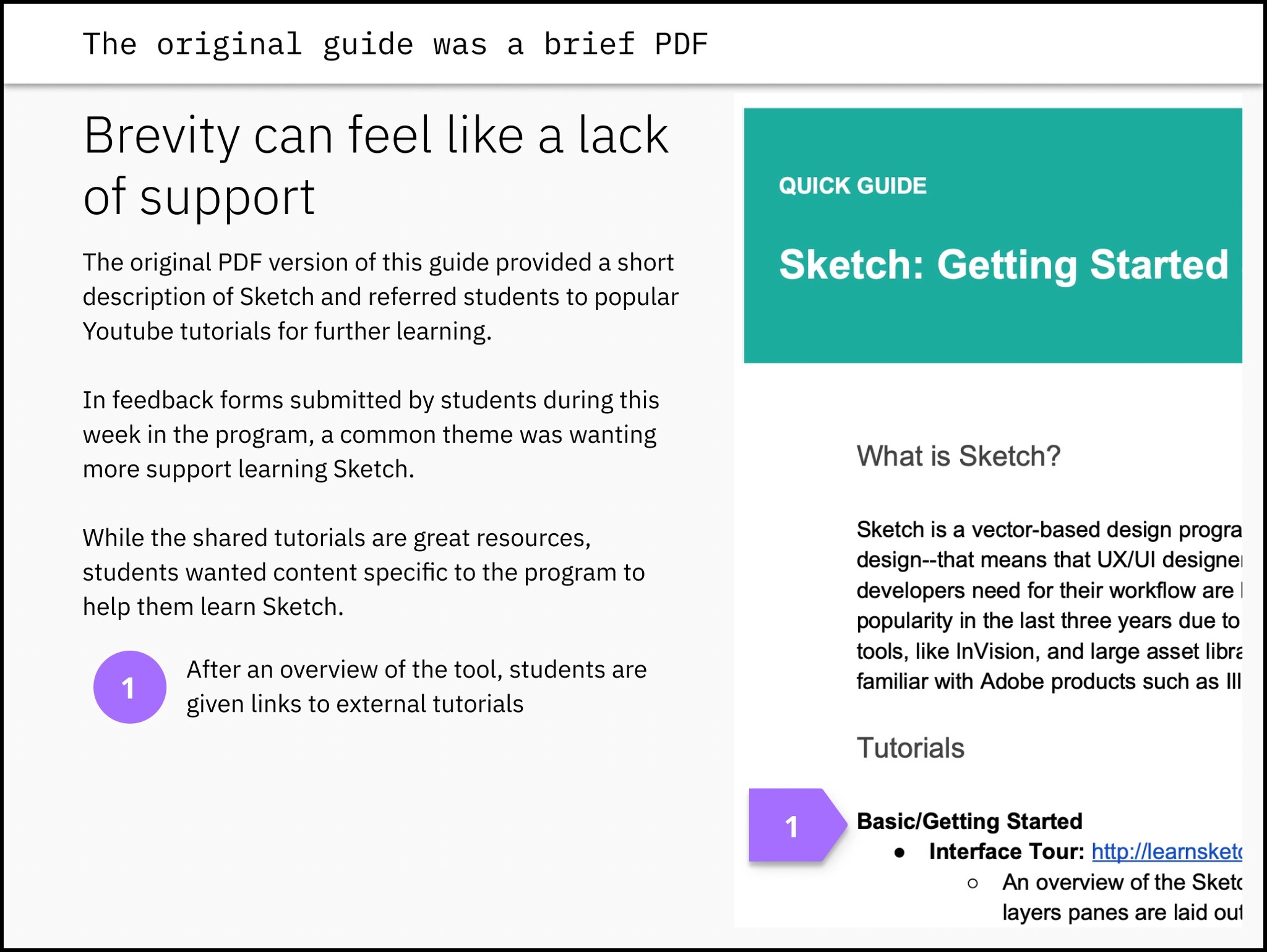
Prime already had a getting started guide for Sketch, which included a short introduction explaining Sketch, as well as links to popular tutorials for beginners.
At two just pages long, the guide did a great job condensing important resources into an accessible format.
However, feedback from students showed that they felt it was too brief. They also disliked that it relied on external resources instead of content produced by Prime.
Next iteration
Expanding on what existed
My first approach was to expand on the existing document. Because my assumption was that the main problem was a lack of content, I expected any new content produced to add value.
I started by creating a mind map in the tool MindNode to plan what concepts to add or revise.
The original guide contained:
What is Sketch? - an introduction to the tool
Tutorial links
This new guide would add
Instructions for installing Sketch
Information for getting started, such as an introduction to the interface
An introduction to working in Sketch, explaining things like shapes and color pickers

A lengthier PDF
Using Notion, I created a new document covering the new topics I had planned.
To stay consistent with the previous iteration, I used Notion as a typical word processor, like Google Docs or Microsoft Word, then exported and shared my revised copy as a twelve page PDF.
Experimenting with other mediums
Because Notion documents can be published to the web and shared as a URL, this version was also shared as a hyperlink in the cohort’s Slack.
This was the first time Prime used Notion to create an online resource, and was an early experiment in alternatives to PDFs.
Iteration results
More information can be less informative
This expanded guide had little positive impact. While it contained much more information, this more robust guide ended up being more intimidating to users.
In the original design, students read through the guide and wished there was more.
In this iteration, students skimmed through the guide, largely ignoring most sections.
What was working, no longer worked
The cohort using this guide began asking for more information and basic tutorials more than previous cohorts.
Because the guide was longer, and links to outside tutorials were placed at the end, any tutorials were now at the bottom of a twelve page PDF.
In this version of the guide, most users never found the links to additional external resources, because they had become buried.

Two big takeaways
Students want a medium other than text
While students largely ignored this guide, they still actively explored learning Sketch.
In Slack, students continued to share resources that helped them learn — and these resources were almost exclusively video tutorials.
For the next iteration, I wanted rely more on video, the medium that students wanted to receive the information in.
A single-page document isn’t the right choice for this situation
Students felt overwhelmed by a twelve page document explaining the program.
Because Notion allows you to use documents as wikipedia-style websites, I wanted to explore digital tools for chunking information, such as collapsible accordions and sub-pages.
Final iteration
Adding structure
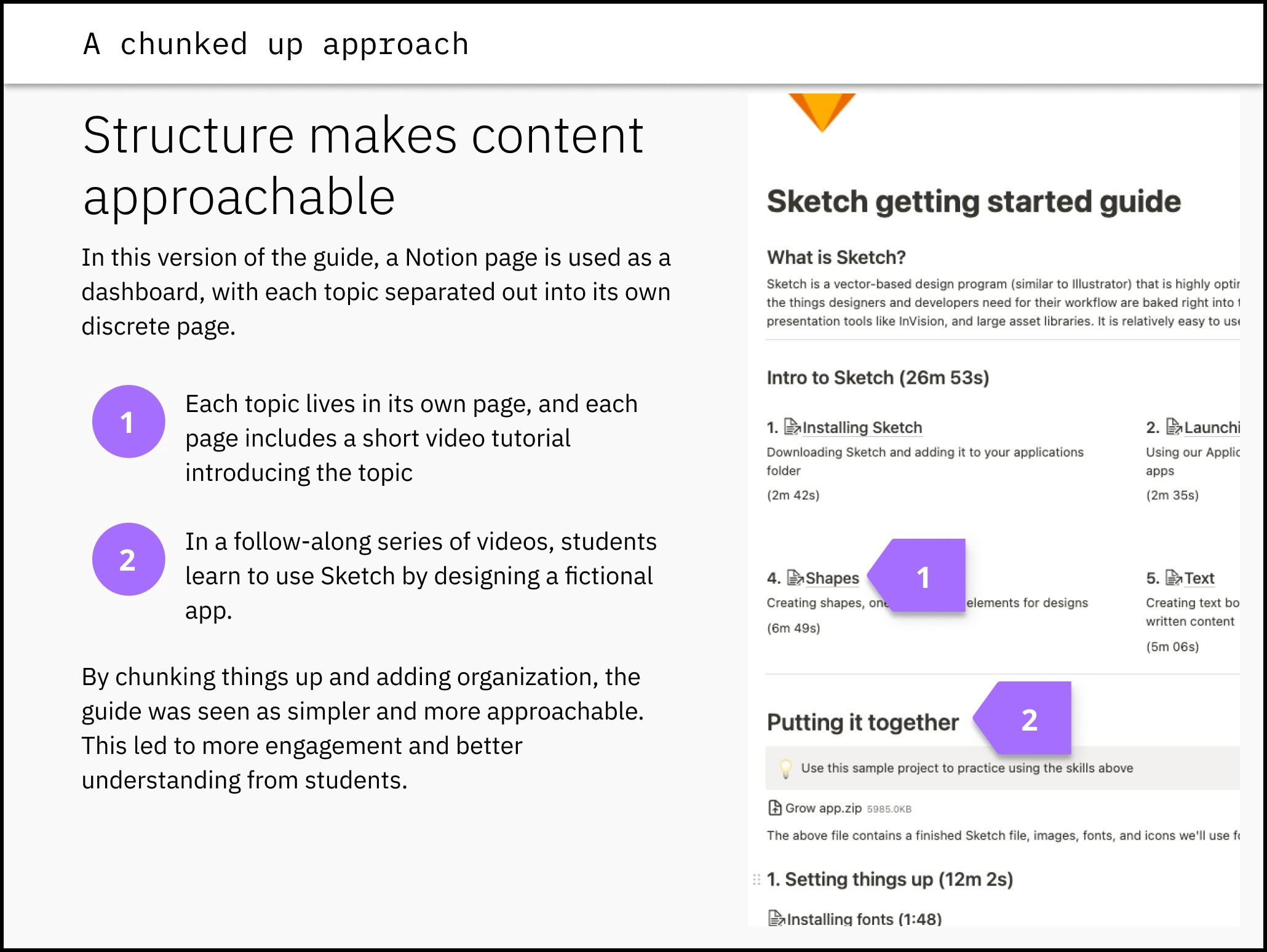
In the next version of the guide, I focused on chunking up information.
In this iteration, the guide is broken up into concepts, with each concept receiving its own page in Notion.
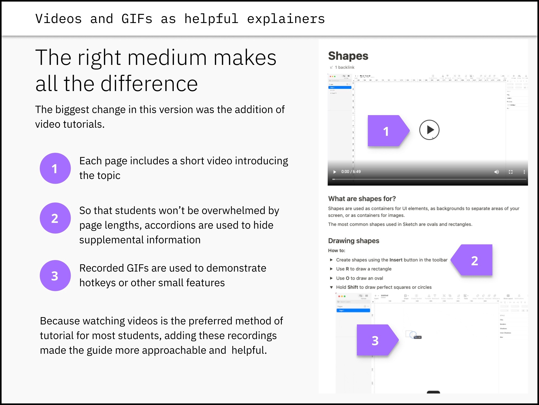
On each concept page, a video demonstrates the concept, with summaries and tips provided in text below the video.
Some major changes in this version were:
use of pages to chunk up information
use of accordions to hide supplemental information and prevent information overload
video tutorials I recorded for users to watch or follow along with
body text as a supplement instead of the primary way of delivering information
Adding video
In total, about 3 hours of videos were created to guide students through getting started with Sketch.
These videos covered
downloading and installing Sketch
understanding the interface and basic controls
building those skills in a follow-along practice project to design four screens of a fictional app
Introductory videos were kept to five minutes or less in length, while the follow-along project videos were allowed to reach up to 20 minutes.
The follow-along project was helpful for demonstrating specific workflows, such as downloading and adding icons, using Unsplash for images, and other common but not-obvious techniques.
In addition to videos, GIFs were added to demonstrate smaller key features.
Iteration results
Used more and enjoyed more
In the original guide, students were frustrated with the brevity of material for learning Sketch.
In the second iteration, students were overwhelmed by how the content was structured, and ended up ignoring the guide completely.
In this final iteration, students engaged with the material, and went out of their way to give positive feedback about how much it helped them.

Conclusion
How information is presented is a part of design
When starting this project, I focused on adding information that I knew was missing from the original version of the guide.
That approach didn’t end up being effective — even though the revised document had a lot more information than the original, it ended up being used less, because its presentation was overwhelming or confusing.
The final version of the guide was a success because it was able to provide that same information in a way that empowered users instead of frightening them.
Different audiences desire different mediums
Because the document was originally in a text-only format, my first instinct was to expand on that by adding more text.
However, it became clear that video is much more effective for most people who are at the beginning stages of learning a new skill. It is easier to understand how something works by seeing someone perform an action, instead of having it described.
Videos also have the advantage of being accessible to people who have dyslexia, a common disability which makes it extra challenging to learn from lengthy paragraphs of text.
Takeaways for the future
This project helped me understand how many ways there are to present information, and how many choices get made when presenting it.
To create an understanding for your audience, it’s necessary to be thoughtful about what you are trying to communicate, and to be intentional about how you are communicating it.
These learnings were a huge help in other work I’ve done since this project, such as workshops with stakeholders, presenting work to developers, and public speaking.